Saturday, May 31, 2014

Climbing Everest in 3d


The Discovery Channel has created an impressive looking 3d climb of Mount Everest.

The Everest Avalanche Tragedy website explores the tragic accident which killed sixteen Nepalese guides on 8th April.  The avalanche occurred near Everest Base Camp on the southern side of Mount Everest and resulted in the deaths of the sixteen guides and serious injuries to nine other guides.

The site includes an interesting 3d ascent of the mountain. In effect the climb is just a video of (what I assume is) a 3d map of Everest. However the video is linked to an elevation scale and as the video plays you can keep track of the rising elevation.

The visualization itself is fairly simple but is also quite impressive. Creating something similar would be fairly straightforward by creating and videoing a Google Earth tour and then using JavaScript to create links from the video to other elements on the webpage.

Friday, May 30, 2014

Mapping School Segregation


Sixty years after the 'Brown vs Board of Education' Supreme Court ruling that state laws establishing separate public schools for black and white students was unconstitutional the Miami Herald has been exploring whether Miami-Dale's schools are still segregated.

The Miami Herald's report into The Changing Demographics of Miami-Dade Schools includes a revealing interactive map, which allows readers to explore the demographic of 460 Miami-Dade schools.

The map uses colored map markers to highlight schools on the map where 85% or more of the students are black or Hispanic. You can select individual schools on the map to view the complete demographic make-up of the student body, with percentages for the number of black, white, Hispanic and 'other' students.

Via: Visual Loop


The sectarian divide in Northern Ireland has resulted in a large proportion of people living in areas where the population are either predominantly Protestant or predominantly Roman Catholic. To overcome this religious 'apartheid' and to ensure that the children of both religions are not segregated Northern Ireland needs inclusive schools, schools where pupils are able to mix and learn alongside children of other religions.

Unfortunately Northern Ireland's schools are as segregated as the rest of Northern Ireland society. According to The Detail "almost half of Northern Ireland’s schoolchildren are being taught in schools where 95% or more of the pupils are of the same religion".

The Detail has used data from the Department of Education to map the religious segregation in Northern Ireland's schools. The Detail's Segregated Schools map reveals the percentage of Roman Catholic and Protestant pupils in each of Northern Ireland's schools.

Mapping Game Worlds with Leaflet

Over the last few years a lot of video game fan websites have been publishing interactive mapped guides to game worlds. One way to create a powerful interactive game world map is to use the Leaflet mapping platform. To do this you first need a static image map of your game world. You then need to turn your image map into map tiles which can then be used with the Leaflet platform.

If you want to create your own map tiles to use with Leaflet.js Zoomable Images with Leaflet provides a very detailed tutorial explaining how you can use GDAL2Tiles and MapTiler to render map tiles from an image and use them with the Leaflet mapping platform.

Another option is to use Zoomify to create your map tiles. Showing Zoomify Images with Leaflet explains how to do this and includes a Leaflet plugin to add the tiles to your Leaflet map.


The ArcheAge Interactive Map is a map of the game world used in the MMORPG ArcheAge. The game world of ArcheAge consists of three continents, Haranya, Nuia and Auroria.

The map allows you to explore all three continents and to view important locations in the game, including Nui's tears, ships, portals, ore, trees and animals.

 
DayZDB is another Leaflet powered map of a computer game world. DayZ is a multiplayer open world survival horror game that takes place in the fictional post-soviet country of Chernarus.

The DayZDB map includes a number of options to refine the markers displayed on the map. The map sidebar includes buttons to filter the displayed markers by Residential, Military, Farm and Industrial.

Thursday, May 29, 2014

Mapping A Line in the Sand


The Line in the Sand Map is a really well designed Mapbox map which contains video interviews with residents who live along the route of the proposed Northern Gateway Pipeline in Canada. The Northern Gateway Pipelines Project plans to build a twin pipeline from Bruderheim, Alberta, to Kitimat, British Columbia.

The Line in the Sand is a collaborative campaign to help share the opinions and stories of those who will be directly affected by the pipeline. This video map is a part of that project, which will eventually become a feature-length documentary.

I've done a lot of video mapping myself over the years and I really like the video thumbnail markers on this map. If you mouse-over a marker it expands a little and plays a silent preview of the video. Click on the marker and the video will open and play.

Car Crashes in New York


Collisions Aggregated by Time of Day is an animated map of New York car accidents. The map animates through a 24 hour period revealing the time of day when most car collisions occur in different parts of the city.

Like a lot of Torque library maps Collisions Aggregated by Time of Day is a powerful visualization of a large dataset. However the map doesn't hold any great surprises. As you would expect the map reveals that less traffic accidents occur during the early hours of the morning. However at around 8 am and the start of the morning commute the number of accidents rises dramatically.


To explore New York's traffic crash data in more detail you can use NYC Crashmapper. This map visualizes New York intersection collision data between August 2011 and February 2014.

Using the filter buttons on the right of the map you can view heat maps of collisions involving pedestrian, cyclist or car driver injuries. You can also use the slide control at the bottom of the map to filter the results shown by date.

If you click on an intersection on the map you can view a detailed breakdown of the type of collisions that occurred there.

Charles Booth's Poverty Map of London


The London School of Economics has released a new online interactive map of Charles Booth's Poverty Map of London.

Charles Booth was an English philanthropist who is most famous for his research into working class life in London at the end of the 19th Century. In the 1800's a large proportion of London's population lived in poverty. Charles Booth didn't believe the claims made by social reformers that a quarter of Londoners lived in abject poverty.

Booth's response was to carry out a huge study into the lives and working conditions of Londoners. He published the results of his research in 'Life and Labour of the People in London'. The publication included detailed 'Maps Descriptive of London Poverty' in which the levels of poverty and wealth in London were mapped out street by street.

Through his thorough investigation into living and working conditions in London Booth discovered that a third of Londoners actually lived in poverty.

The LSE's imaginatively entitled PhoneBooth application is an interactive version of Booth's poverty map of London. The map is overlaid on top of the modern OpenStreetMap of London. It includes a slide control so that you can adjust the opacity of Booth's map and view the modern street map of London beneath Booth's 19th Century poverty map.

PhoneBooth also includes a map of the Index of Multiple Deprivation 2010. This enables you to compare Booth's 19th Century poverty map with the current social conditions of Londoners on a street by street basis.

Wednesday, May 28, 2014

Minard Flow Maps


There are numerous ways of visualizing data on maps. Heat maps, scatterplots, dot maps and scaled map markers are all popular methods of geographically visualizing data volumes. One method that seems far less popular is the flow map, as popularized by the British economic cartographer Charles Joseph Minard.

I have seen a number of attempts to recreate Minard's famous flow map of Napolean's March on Moscow. However I can't remember seeing flow maps being used in many other contexts in the world of interactive maps.

This Esri Story Map of Minard's March on Moscow is a neat narrated map of the important events during Napolean's military campaign. Unfortunately there seems to be a bug in the map that prevents the map tiles being shown when the map is zoomed out. This means that you have to keep zooming in on the map to view the map tiles.

If you want to see a zoomed out mapped visualization of Minards' flow chart you can check out Napoleon's March. This Leaflet reworking of Minard's flow map is a good attempt at an interactive map visualization of Napoleon's army movements and dwindling size. Unfortunately this map lacks Minard's temperature chart that visualized the freezing temperatures faced by Napoleon's army as they pushed eastwards.


Charles Joseph Minard also created a flow map of British coal exports in the year 1864. This Esri map is a faithful interactive reproduction of this lesser known Minard flow map. English Coal Exports 1864 shows the countries where Britain exported coal to and the quantities exported to each country. The width of the lines on the map represent the quantities of coal exports for each part of the route.

Mapping Blight in the Motor City


The Blight Removal Task Force was set-up in Detroit in order to address the growing problem of blighted properties in the city. The first step in being able to clear and remove the blight affecting residential, commercial, and public structures in the entire city is to know where they are.

Motor City Mapping is the result of a city wide physical survey of all land parcels in the city. The map visualizes the results of the 5,279 parcels surveyed so far and allows the Task Force to identify and prioritize parcels requiring attention.

The map provides heat map views of the condition and occupancy of buildings surveyed. Heat maps can be viewed by neighborhood, zip-code areas, council districts and by census tracts. The map also provides heat map views of vacant lots with dumping, structures with fire damage and structures that need boarding.

Mapping Pittsburgh's Immigrant Communities


Where Immigrants Live in Allegheny County is a scatterplot map of where Pittsburgh's immigrant communities live in the city.

Each dot on the map represents one Pittsburgh resident. The dots are colored to show the area of the world where each citizen was born. The scatterplot points can be filtered by region of origin to reveal the areas of the city favored by different immigrant communities. For example, selecting just immigrants of Australian descent reveals that many Australian immigrants have chosen to live in the area to the west of Bird Park.

The map was created with Mapbox and Leaflet.js. The scatterplot layer was created in QGIS using census data. If you are interested in learning more about how the map was created Databurgh has published a helpful tutorial on Building a Scatterplot Map in QGIS and TileMill.

Mapping London's Inventions


I wonder how many Londoners have had a coffee in Bar Italia without realizing that they were sitting in the very spot where John Logie Baird invented television?

From Charles Babbage's Difference Engine, to John Logie Baird's television it is fair to say that London has seen it's fair share of inventions. London's Greatest Scientific Experiments is a StoryMaps tour of some of London's 'most radical' experiments.

The map provides an interesting tour through some of the scientific discoveries which have been made in the capital. The map itself however is never really going to serve as a mapped guide to anyone wanting to visit the locations highlighted on the map. The styled map does not include road labels so it would be hard to actually use it as a guide to tour the locations in person.

By using Knight Lab's StoryMap library however the application is able to provide a sequenced tour through the mapped experiments. You can use the forward and back arrows to navigate through the experiments or you can click on the markers on the map to navigate the experiments by location.

Tuesday, May 27, 2014

Real-time Cosmic Events on Google Sky


Over the years one of the most underused features of the Google Maps API has been the planetary map types and Google Sky map tiles. This is probably why it isn't even supported in V3 of the Maps API.

Despite the lack of support for the planetary map tiles in the Maps API it is still possible to hack the map tiles and use them with Google Maps. SkyWatch has released a new beta application which uses Google Sky to map real-time cosmic events as reported by NASA.

NASA shares data with other scientists and space observatories around the world. The SkyWatch app cherry-picks some of the most interesting cosmic events from that data and shows the location of the events on an astronomical map of the night sky.

The latest cosmic events are displayed in the map sidebar and you can click on the 'sky view' link for each event to see it mapped on the Google Sky map.

If you want to use Google Sky or the planetary map tiles (for the Moon and Mars) on your own maps then you can use this example code available on Google Code.

7,000 Texas Disposal Wells on the Map


The Texas Tribune has published a map showing the location of disposal wells where waste-water, often from hydraulic fracturing sites, is being disposed of in the state. Texas Disposal Wells visualizes the location of 7,000 disposal wells in Texas.

The map uses hexagonal binning to highlight the number of wells within an area.. You can zoom in on the map to view the location of the individual wells.

The Texas Tribune uses the Mapbox platform. Mapbox has written a nice tutorial on how to use hexagonal binning with Mapbox created maps. Binning: an Alternative to Pointmaps explains how the free and open source QuantumGIS tool can be used to create a hexagon density layer, which you can then overlay on top of a Mapbox map.

Pimping Hyperlapse

Teehan+Lax's popular Hyperlapse creates animated Street View drives for any route that has Google Maps Street View data available. The code for Hyperlapse is available on GitHub and has proved a source of inspiration for a number of Google Maps API developers.


Ecolapse is a nice extension of the Hyperlapse library. Using Ecolapse you can create an animated Street View drive with a very clever overhead 'small world' effect. Ecolapse distorts the Google Street View imagery to portray an overhead view rather than the normal Google Maps landscape view.

You can create your own animated Ecolapse drives simply by dropping two map markers onto a Google Map, to indicate the start and end of your journey. When the animation is created you have the option to pause the animation, zoom in and out of the Street View and use your keyboard arrow keys to scroll through the route frame by frame.

Hat-tip: Google Street View World


Skoda has used the popular Hyperlapse Street View animation tool to create a cool promotional website for the Rapid Spaceback.

The Rapid Spaceback website lets you view a number of animated journeys on Google Maps Street View. To spice up the action the site has added a number of filters that you can apply to the animated route, including a kaleidoscope or mirror view. You can also choose from a number of different soundtracks to accompany your drive.

The site includes a number of prepared routes from famous locations around the world. You can also create your own route by selecting a starting point and a destination on a Google Map.


HyperlapseMB uses the depth information hidden in Street View data to add a nice motion blur effect to a Street View animated drive. The motion blur eliminates a lot of the jerkiness in the resulting animation, which is caused by stitching a sequence of still images together. The result of adding motion blur is a much smoother animation.

HyperlapseMB applies the motion blur effect before the Street View animation can be played. Therefore HyperlapseMB is a bit slower than the original Hyperlapse, but it is worth the wait. Not only is the animation much smoother but the controls in the side-panel allow you to adjust the view in the animation and even spin the animation around.

The Educational Sectarian Divide


The sectarian divide in Northern Ireland has resulted in a large proportion of people living in areas where the population are either predominantly Protestant or predominantly Roman Catholic. To overcome this religious 'apartheid' and to ensure that the children of both religions are not segregated Northern Ireland needs inclusive schools, schools where pupils are able to mix and learn alongside children of other religions.

Unfortunately Northern Ireland's schools are as segregated as the rest of Northern Ireland society. According to The Detail "almost half of Northern Ireland’s schoolchildren are being taught in schools where 95% or more of the pupils are of the same religion".

The Detail has used data from the Department of Education to map the religious segregation in Northern Ireland's schools. The Detail's Segregated Schools map reveals the percentage of Roman Catholic and Protestant pupils in each of Northern Ireland's schools.

The map uses pie chart map markers to reveal the percentages of the religious intake of the country's schools. If you want to add proportional pie chart markers to your own map then you can use the Google Visualization API to create your pie charts. Once you have created your pie charts you can then add them as markers to your Google Map.

E-techpulse's How to Create Pie Charts on Google Maps, includes all the code that you will need to add Google Visualization pie charts as markers to a Google Map.

Berlin's European Elections Map


Berliner Morgenpost's map of the European election results in Berlin

Yesterday I started writing a round-up of European election maps created by newspapers across Europe. However I was so disappointed with the general quality of the maps created that I quickly scrapped the post.

The one map that I was impressed with was by the Berliner Morgenpost. Europawahl 2014 Alle Stimmen in den 529 Berliner Wahlkiezen is a map showing the results of the European elections in each of Berlin's 529 election districts.

Like the Berliner Morgenpost's map of the German National Election the results in the European elections show that there is still a clear dividing line between voters in the old eastern and western blocks in Berlin


Berliner Morgenpost's map of the German national election results in Berlin

Almost 25 years after the collapse of the Berlin Wall the Berliner Morgenpost map reveals a political wall still exists between East and West Berlin and that this  political wall runs almost exactly along the line of the old Berlin Wall. To the east the Left Party emerged triumphant, while in the west the CDU and the SPD were the political winners.

The Berliner Morgenpost's European Elections Map is itself a really well designed visualization of the Berlin election results. The map provides a simple visualization of the overall winners in each electoral district in Berlin by shading each district with the color of the winning party. If you click on an electoral district on the map you can view a breakdown of the results for each party and you can also compare the 2014 results with the votes cast in the district in the 2009 European Elections.

The map also uses an effective polygon knockout effect to hide all of the map except for Berlin. If you want to recreate this effect with Google Maps you can use Vasile Cotovanu's polygon masking wizard Geomask. Using Geomask it is possible to create a doughnut type polygon which only shows the map through the hole in the doughnut polygon. The effect of using Geomask is to highlight the relevant area on the map and mask the rest of the map.

Another effective design element of the map is that when you click on an electoral district on the map a line is drawn from the district to the results in the map sidebar. It appears that the Berliner Morgenpost had discovered a neat method for drawing a polyline from the map to a static element outside the map.

Monday, May 26, 2014

Mapping Colorado Oil Spills


Colorado experiences, on average, one oil spill a day. In total that is 4,900 spills in the last thirteen years. The result of all those oil spills was the release of nearly 102 million gallons of oil, drilling fluids and other toxic materials into the environment.

The Western Toxic Release Map shows the location of 13,600 spills in Colorado and New Mexico between 2000 and 2013. You can click on any of the spills displayed on the map to view the date of the spill and the number of gallons spilled. You can also click-through to view the full Oil Conservation Division report on the spill.

You can filter the results shown on the map by year or view the total 14 years of oil spills in one go.

Via: Visual Loop

World War II on Street View


The Guardian has released its latest series of photographs superimposed on top of Google Maps Street View imagery. In the Second World War in Google Street View The Guardian has taken a number of historical photographs taken during World War II and found the exact same view depicted in Google's panoramic imagery.

The photographs used include pictures of the Nazis marching through Paris, London during the blitz and Hiroshima suffering from the devastation caused by the nuclear bomb.

You might also like The Guardian's Classic paintings of world cities meet Google Street View, Classic London paintings in Google Street View and Classic Album Covers in Street View.

Territorial Disputes in the South China Sea


In the last couple of months tensions have been running high in the South and East China Seas as China and Japan have both escalated their military presence in the area. China has also become caught up in diplomatic rows with Vietnam, Taiwan, Malaysia, the Philippines and Brunei over long standing conflicting claims over territorial rights in the China seas.

Al Jeezera has published a map examining the history of the South China Sea Disputes. The map explores some of the historical hot-spots between China and its neighbors in the area since 1974. The map irtself was created using Leaflet.js and the Knight Lab Story Maps library.

The Story Maps template means that you can explore the map chronologically, using the forward and back arrows to progress through Al Jaeera's mapped history of the region. You can also click on the map markers to jump to individual locations on the map.

The European Cup Final Map


Last week I was impressed by the Twitter FA Cup Final 2014 map. This CartoDB Torque powered map visualized the global Twitter mentions for the two competing teams before, during and after the English FA Cup Final. We now have an even better animated Twitter map of the European Cup final between Real Madrid and Atlético Madrid.

Essentially the Real Madrid v Atlético Madrid: #UCL final map follows the same approach as the FA Cup Final map. It provides an animated heat map of Tweets made around the world mentioning either of the two teams, during the 120 minutes of the game. However the addition of a simple time-line helps to make this map far more engaging than the FA Cup Final map.

The time-line running along the bottom of the map highlights key moments during the game (goals, yellow cards & substitutions). This helps to contextualize the results shown on the map. Scroll the time-line to '21:26' and you can see that the explosion of red on the map was caused by Atlético Madrid's opening goal. Similarly if you scroll the time-line to '22:38' you can see that Real Madrid's equalizer resulted in a huge explosion of Tweets mentioning the team.

The Real Madrid v Atlético Madrid: #UCL final map is a great demonstration of CartoDB's Torque library. It shows how an animated map coupled with a simple time-line can provide a very powerful tool for exploring very large data sets over time.

Sunday, May 25, 2014

The Maps of the Week


In the 19th Century Govan in Scotland was one of the world's leading ship-building centers. Like many dockland areas Govan became an area popular with immigrants. The number of foreign ships coming into Govan coupled with the area's high employment meant that Govan proved attractive to many immigrants.

Immigrants to Govan came from all around the world. There were Irish emigrants escaping the potato famine, there were Eastern Europeans fleeing the anti-Jewish pogroms in Russia and there were also English immigrants looking for work.

Govan Scotlands's Melting Pot is a fascinating Google Map visualizing the home addresses of foreign born individuals in Govan, using data from the 1881 census. Using the map it is possible to view the areas in Govan where immigrants lived. You can even filter the results by nationality so that you can find out where different nationalities liked to live.

If you select a marker on the map you can view information about the individuals living at an address, with details about their ages and occupations. It is fascinating exploring the map and discovering the types of employment favored by the different nationalities living in Govan in the late 19th Century.


Do you know what lies buried beneath your back yard?

There are nearly one million chemical spill sites in the United States. Who knows what other environmental hazards lies beneath the ground in your neighborhood?

WhatsDown do, that's who.

WhatsDown is a map of the buried environmental and health hazards in the United States. You can search the map by any location and discover what spill sites, groundwater plumes, environmental protections and munitions areas can be found nearby. Click on a marker and you can view detailed information about the spill, its implications for human health, and the efforts made to clean it up.


I have no shame so I'm going to include my own Paintings on Street View in this week's Maps of the Week. This little application superimposes landscape paintings from the Metropolitan Museum of Art on top of Google Maps Street View. The app includes paintings of Paris, Naples, Venice and New York.

The Metropolitan Museum of Art has released 394,000 images from its collection into the public domain. These images can now be downloaded for limited non-commercial, educational, and personal use. I've taken some of these paintings and superimposed them on top of the Google Maps Street View images of the scenes depicted.

Use the orange 'Menu' button in the app to view the available paintings and click on a painting thumbnail image to see it superimposed on Street View. You can use the slider control to adjust the opacity of the painting and to view the Street View area hidden beneath.

Mapping Factory Farms in Michigan


The Center for Food Safety has created an interactive map with some powerful visualization and search options which allow you to explore the impact of Confined Animal Feeding Operations in Michigan. The map is designed to help highlight how large animal factories can affect the local environment and local communities.

The Factory Farms map shows the location and the sizes of animal factories in Michigan. You can click on each of the mapped farms for an overview of the number of animals farmed and the amount of manure produced. You can also find out which waterways, schools and hospitals are situated within a 5 mile radius of each farm.

The map includes a number of useful visualization tools. You can filter the information on the map to show the location of schools, hospitals and watersheds as well as the location of the factory farms. You can also resize the circular farm map markers to proportionally represent the number of animals or the amount of subsidies each farm receives.

Via: Visual Loop

Saturday, May 24, 2014

Love Will Tear These Maps Apart


Peter Saville's design for the sleeve of Joy Division's Unknown Pleasures album is one of the most loved examples of music cover art. The white on black lines of the album cover were inspired by an image of radio pulsar waves.

This iconic design has now become one of the biggest influences on map design. Mapbox are the latest cartographers to take inspiration from Peter Saville's design. San Francisco Terrain visualizes the topography and contours of San Francisco with height being shown on the map by a series of black lines on a white background.


Elevation Lines is a Leaflet map which also takes inspiration from the Unknown Pleasures album in its design. The map also visualizes elevation data as a series of vertical lines, presenting a global view of elevation data. With Elevation Lines you can even click on the map to add a profile path between any two points.


This Worldwide Population map also owes design inspiration to Joy Division's iconic album cover. The map uses d3.js to create a map of the world which represents population density by latitude.

The map uses population data from NASA. You can select to view the population densities for a number of different years, which means that you can view how the global population has changed over the last twenty years. The map was inspired by James Cheshire’s Population Lines. If you find this population visualization as beautiful as I do you can buy prints of James' map from his website.

Football Causes Cancer


Supporting a football club is a lifetime commitment. Your team must come before everything and anyone else in your life, whether that be kids, partner or career. Your team's name must be the last words that you gasp with your dying breath.1

One popular chant with football fans across the world is:

"I'm Arsenal (replace with the name of your own club) till I die."

Chris Cook of the BBC has decided to take this football song literally and explore just how long football fans in England and Wales have committed to support their local team. In Life expectancy: Which football fans are Premier League? Chris looks at the life expectancy of football fans for each team in England.

To work out the life expectancy of football fans Chris looked at the areas around the grounds of football clubs, calculating the life expectancy of the closest 100,000 men living in the vicinity of the stadium.

Kenneth Field has taken Chris's research and created a map showing how long fans of the various clubs in England and Wales can expect to live. Football till [they] die shows an interpolated surface of life expectancy in England and Wales. You can click on each of the club's markers on the map to view the life expectancy of fans, the club's ranking in the league of life expectancy, the percentage of obese fans and the percentage of the team's fans who are binge drinkers.

Footnotes

Unless you support Chelsea of course. If you support Chelsea you are allowed to support the club only during periods of success and support other teams during the dry years.
I used The Daily Mail research method to determine whether football causes cancer or not (N.B. I made it up).

Friday, May 23, 2014

Link to the Current Map View


Stamen Design has released a nice checklist for creating interactive digital maps. The checklist provides an interesting guide to things you might want to consider when designing your own maps.

Stamen's first checkpoint says that, "URLs should contain and maintain state, by default." In other words as users interact with the map the URL should dynamically update to provide a deep-link to the current map view.

This is one of those features which I always mean to add to my own maps and never quite remember to implement. A dynamic URL aids usability, enables users to bookmark the current map view and can encourage your users to share links to your map with their friends.

Stamen provide a link to leaflet-hash on Github, which will enable you to easily add this feature to a Leaflet.js map.

If you are developing maps using the Google Maps API then you might want to check out geocodezip's Link to This map. This map doesn't actually update the URL on the fly but does provide a handy link to the current map view.

The Underwater Grasses Map


Underwater grasses play an important role in the ecosystem of the Chesapeake Bay. The Chesapeake Bay Program's goal is to have 185,000 acres of underwater grasses in the Chesapeake Bay.

The Chesapeake Bay Grasses Map is a mapped timeline of Chesapeake Bay grasses from 1984 to 2010, tracking changes in the health of underwater grasses in the Bay over this time. As well as the mapped timeline visualization you can click on different locations on the map to view details on water temperature, salinity and turbidity in the area and find out what grass species live there.

Mapping the Workplace Population


The UK's Office for National Statistics has released a new mapped visualization of the workplace population in the UK.

The ONS Workplace Population map uses data from the 2011 UK census. The map allows you to explore heat maps of the age, employment status, qualifications, and hours worked at census ward level. The workplace population includes all 16-74 year olds in employment by location of their workplace.

Each of the heat maps uses a tonal colour range which makes the maps a little hard to read. This wouldn't be so bad if you could click on the census ward areas on the map to open an information window containing the data for that ward. However clicking on a census ward only seems to highlight it on the map. I would really like to be able to click on individual census wards to view a breakdown of the workplace population statistics for each category of the selected workplace population category.

You can explore more maps and graphs of UK census data, employment data, economic and population data on the ONS Interactive Content site.

Thursday, May 22, 2014

Lightning Strikes Twice on Google Maps


We've always been suckers for live weather maps on Google Maps Mania. With some huge storms heading across Europe at the moment this is a great time to check out some real-time lightning maps.

LighteningMaps is a live Google Map of lightning strikes across the globe. I like the animated flashing circles that flash on the map to record each lightning strike. The map doesn't include sound but I found it much more fun to add your own sound effects (go on give it a try - you know you want to).


Blitzortung.org works with a community of users, who have built their own lightning receivers, to automatically display live lightning data on a Google Map.

Blitzortung.org includes instructions on how you can build your own lightning monitor and also includes instructions on how you can build your own Google Map based on the data received from a lightning monitor.

If you can't be bothered to build your own lightning box you can always just check out Blitzortung's live Google Map of lightning strikes.

More Landscapes & Street Views


I've updated my Paintings on Street View application with some more landscape paintings from the Metropolitan Museum of Art. The application now includes paintings of Paris, Naples and New York, in addition to the previous paintings of Venice.

The Metropolitan Museum of Art has released 394,000 images from its collection into the public domain. These images can now be downloaded for limited non-commercial, educational, and personal use. I've taken some of these paintings and superimposed them on top of the Google Maps Street View images of the scenes depicted.

Use the orange 'Menu' button in the app to view the available paintings and click on a painting thumbnail image to see it superimposed on Street View. You can use the slider control to adjust the opacity of the painting and to view the Street View area hidden beneath.

Wednesday, May 21, 2014

Venice Views & Street Views


The Metropolitan Museum of Art has released 394,000 images from its collection into the public domain. These images can now be downloaded for limited non-commercial, educational, and personal use.

The Metropolitan Museum of Art's collection includes some gorgeous painting of Venice. I've taken some of these paintings and superimposed them on top of Google Maps Street View images of Venice. Views of Venice allows you to view the paintings on top of the modern Street View image of the scene depicted.

Use the orange 'Menu' button in Views of Venice to see the available paintings and click on a painting thumbnail image to view it superimposed on Street View. You can click the 'Clear' button at any time to remove the painting from the Street View (just return to the menu to add the painting back).

Tuesday, May 20, 2014

Auto Photo Mapping with Google+ Stories


This week Google are releasing Google+ Stories, a new feature on Google+ which can automatically organize your photos and videos into a beautiful mapped travelogue.

Stories will be available this week on Android and on desktop, with iOS coming soon. If you want to get a sneak preview you can check out some example Stories created by paraglider Tom de Dorlodot, DJ Steve Aoki and Allrecipes photographer Angela Sackett.

Stories will automatically be created for Google+ users by Auto Awesome. Apparently if you have backed up your photos and videos on Google+ you may already have a mapped travelogue Google+ Story ready for you to view on Google+.

Dialect Maps


Phonemica is a really interesting map of Chinese spoken stories. The project was conceived as a way to preserve spoken stories in China as spoken in the local vernacular.

Anyone can record a story at home and submit it to the map. Different Chinese languages and dialects are differentiated on the map by different colored map markers. You can also filter the results shown on the map by location, keyword and language / dialect.

If you click on a map marker you can click through to listed to the submitted story recording.


The most popular interactive webpage on the New York Times website last year was How Y’all, Youse and You Guys Talk. This interactive feature asks you a series of questions about your pronunciation and use of certain words and from the answers creates a personal dialect map. The resulting heat-map shows you which areas of the US have dialects similar to you.


Back in 2010 the British Library asked people to map their voices in order to create a Google Map of how English is spoken around the world.

The Map Your Voice project is a Google Map of recordings made by people while reading the children's story 'Mr. Tickle' by Roger Hargreaves. This particular story was chosen for the range of English sounds it contains when read out loud.

Bored Bill's Top 10 Street View Chart

This week's top 10 musical Street View apps, as complied by Bored Bill.

1. Alan AtKisson - American Troubadour

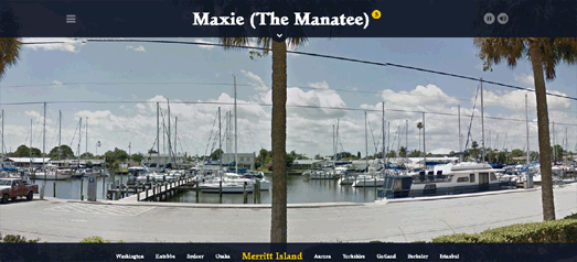
Straight in at number one this week is this new release from Alan AtKisson 'American Troubadour'. To promote the release of his new album AtKission has created a website which uses Google Maps Street View to showcase the locations which inspired the album's songs.

The website starts with a Google Map which displays the locations featured in each of the album tracks. If you select a song's marker from the map you can view a Street View of the scene that inspired AtKisson to write the song. While you explore the scene in Street View you can also listen to the song.

Click on the down arrow at the top of the Street View and you can read Atkisson's account of why the scene displayed in the Street View is so important to him.

2. DJ Tiësto - A Town Called A Paradise

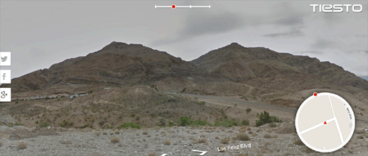
A Town Called Paradise is a clever Street View based game released to promote the new album by Dutch DJ Tiësto.

The game requires you to search the Nevada desert on Street View for the cover art of Tiësto's album 'A Town Called Paradise'. The game includes a radar control which shows you the direction you need to travel to find the cover art. As you wander through the Nevada desert you can listen to music from Tiësto's new album. The music also provides a clue in your treasure hunt, as the song becomes louder the closer you are to your goal.

If you manage to find the three covers hidden in Nevada you can enter a draw to win a trip to New York for two and an invite to the A Town Called Paradise album launch party!

3. P.Morris - 'Debut'

Los Angeles producer P.Morris has released a debut mixtape, actually called 'Debut'. You can listen to the mixtape online at morrismakes.com. The online version of the mixtape combines P.Morris' ambient tunes with the interactive imagery of Google Maps Street View.

Each song is paired with an image taken from Street View. The Street Views are enhanced using WebKit filters, so you will probably need to use the Chrome browser to get the full visual effect. However you only need to turn up your speakers to achieve the full aural effect.

4. Subfocus - Torus

Subfocus has devised an ingenious way to promote his album 'Torus' by creating an impressive Street View game. Subfocus - Torus involves following a serious of map related clues to find 13 shiny tori hidden around the world.

When you find one of the hidden shapes you are rewarded not only with a neat 3d spinning torus superimposed on a Google Maps Street View of the location but you also get to listen to one of the tracks off the album.

Subfocus -Torus is obviously inspired by (and possibly developed by) the equally amazing Floating Shiny Knot.

5. Arcade Fire's Wilderness Downtown

Arcade Fire's Wilderness Downtown is another impressive musician inspired application involving Google Maps and Street View. The application mixes Street View images from around your location, music video and computer animation in multiple animated browser windows.

There is so much going on in Wilderness Downtown that it is a little hard to explain. It's far better to listen to and watch the application yourself.

6. Lykke Li - Wounded Rhymes

Lykke Li is a Swedish artist whose album Wounded Rhymes was also promoted with a neat Street View app. Using the app you can follow Lykke Li's path to places of emotional significance in her life with Google Maps Street View and Google Earth. On your journey you also get the chance to listen to Li's songs.

To find Lykke Li's path in the promotion you need to follow the directions indicated by a compass rose in Google Maps Street View. The compass points in the direction that you have to travel and the distance to travel is given in metres. When you arrive at the specified destination, by navigating with the normal Street View controls, you are rewarded with the video of a song from Lykke Li.

7. Johnny Cash - I've Been Everywhere Man

Johnny Cash Has Been EVERYWHERE (Man)! maps out all the locations mentioned in Johnny Cash's version of the Geoff Mack song 'I've Been Everywhere'.

The map actually plays the Johnny Cash song, displaying the lyrics and dropping markers on all the 91 locations mentioned in the song. A running total of the number of kilometers covered is also displayed. This one doesn't actually use Street View but you can drop pegman on the map to view the Street Views for each of the mapped locations.  

8. The Mountain Goats - Going Somewhere

American folk rock band The Mountain Goats have written a number of songs over the years with the words 'Going to ...' in the title, with a destination completing the song's name.

Going to Somewhere is a fun little Street View application that will take you to a random destination based on one of The Mountain Goats 'Going to ...' songs. Just press 'Go' and you will be transported to a new destination.

The only thing missing from this app is the actual music. It would be great if you could actually listen to the relevant song when each location is shown.

9. Tom Waites

The songs of Tom Waits contain many geographical references. Waits' narrative ballads are full of interesting characters living interesting lives in atmospheric locations.

Jonas Nordström has scoured the lyrics of all Tom Waits songs and created The Tom Waits Map, a Google Map showing all the locations mentioned in the American singer-songwriter's back catalog. Click on a marker on the map and you can find out which song references the selected location and read the relevant lyric.

Again there are no Street View links on this map but just drop pegman on a marker location to see it in Street View.

10. John Mayer - Born and Raised
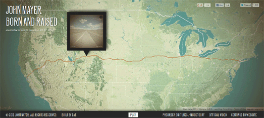
John Mayer's song Born and Raised can be listened to on this Google Map.

Shadow Days allows you to watch an animated Street View movie of a journey across the United States. The geocoder on this map no longer seems to work but you can view the map in action by clicking on the link which says 'Take Tim's Journey'.